
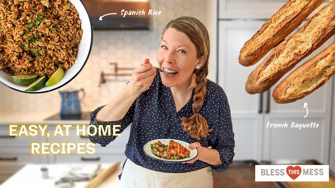
For this project, I took heavy inspiration from the Bon Appétit YouTube channel and their thumbnails. I first took a screenshot of her in a video where the stuff she laid out was not too different from the two meals that she would be cooking. I then used the AI remove background to remove her from the picture and then blurred the background with the gaussian blur filter. Next, I took a photo from her blog, removed that background, and then put her in the foreground as the center. I messed a little with the exposure so that photo fit better. After that, I did the same for the Spanish rice and the French baguette. I tried doing the same for her logo, but I realized the white background looked better than transparent. Lastly, I added “Easy, at home recipes” as a sort of click-bait, attention grabbing text and then added some hand-drawn arrows pointed to the food with their name. I’d love to learn more about removing background, masking, and making an image less fuzzy in the future.
Leave a private review
Use this form to submit a private rating of this material. A notification will be sent to the instructor and may impact scoring. You can use the post comments below for a public comment.
You did a good job creating an even tone on this despite having elements from various different sources—that’s always hard because they all have their own light sources, but you evened them out fairly well. I like labels and arrows pointing to the baguettes and Spanish rice, those are fun and easy to read. Blurring the background is a nice touch also, because it lets the viewer focus on the other items quicker. The only suggestion I have is to make “Easy, at-home recipes” easier to read. That might mean making it black or a different font, you’d have to play around with it, but I’d say it gets a little lost in the design.