Caught in Candy Land
October 26, 2025
For this project, I used a photo of my friends and me from a wig party. Our bright wigs matched the fun colors of Candy Land, so I placed us in that world surrounded by giant candies and lollipops. I added a cotton candy bush in front of us to make it look like we were part of the scene,…
Read More
Rolling with the Hoosiers
October 22, 2025
My bus wrap design celebrates Indiana University football and the unwavering spirit of Hoosier pride. Using IU’s signature crimson and cream color palette, I incorporated the phrase “Never Daunted” to symbolize strength, perseverance, and school unity. The side of the bus features IU players in a huddle to capture the energy and camaraderie of the team, while the back highlights…
Read More
Chic and Hydrated
October 12, 2025
This piece blends a chic, modern aesthetic with a touch of humor. Using Photoshop shape layers, I created a minimalist martini glass layered over a bold red texture and cheetah print background for contrast. The phrase “Stay Hydrated” adds a playful twist to the clean, fashion-inspired design, simple, stylish, and a little cheeky.
Read More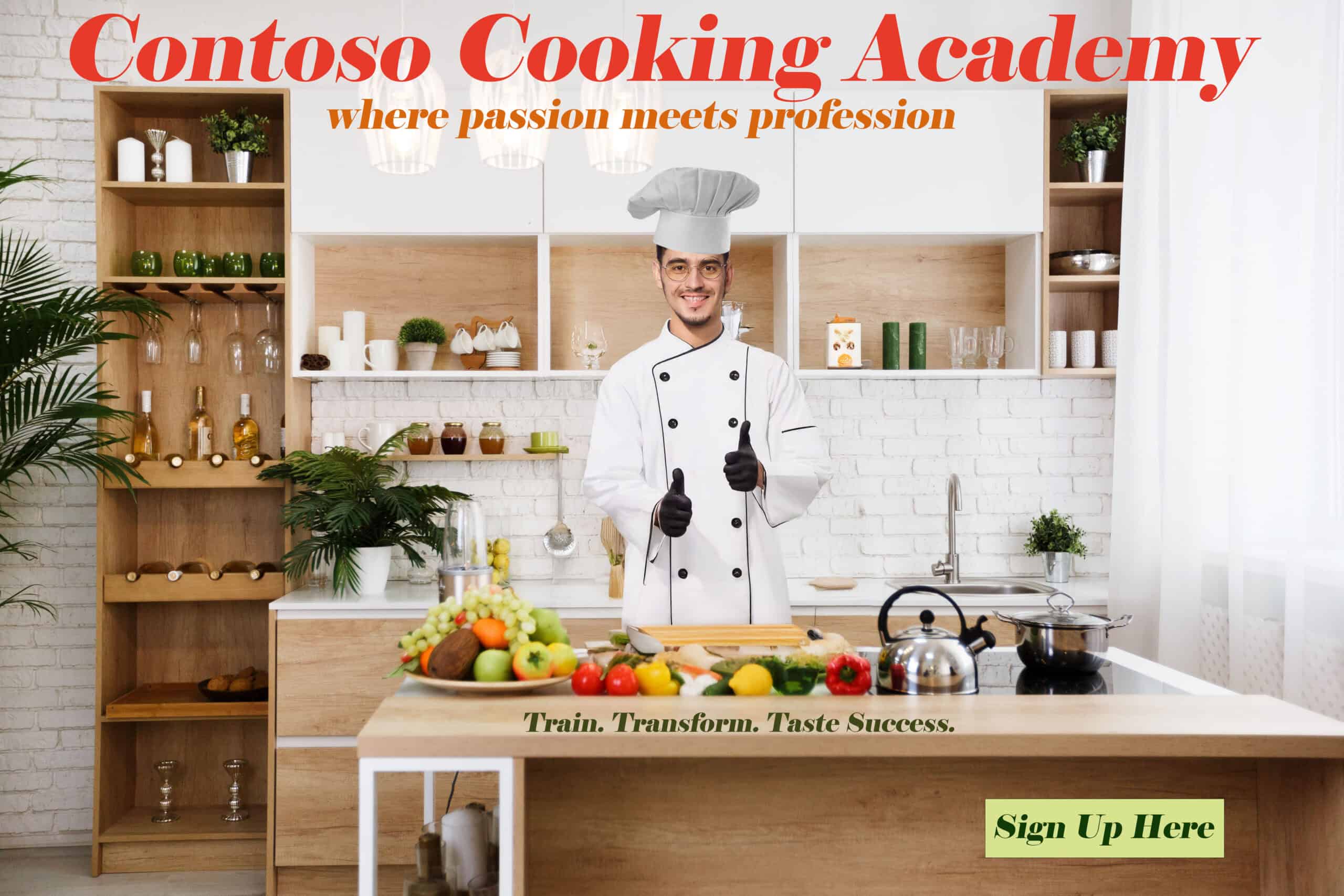
Cook Up a New Career
October 6, 2025
This ad promotes Contoso Cooking Academy as a place where passion meets profession. I transformed the original photo by adding a chef’s jacket and hat to make the subject fit naturally in a modern kitchen scene. The warm red and orange tones were used to create a welcoming atmosphere and draw focus to the headline. My goal was to design…
Read More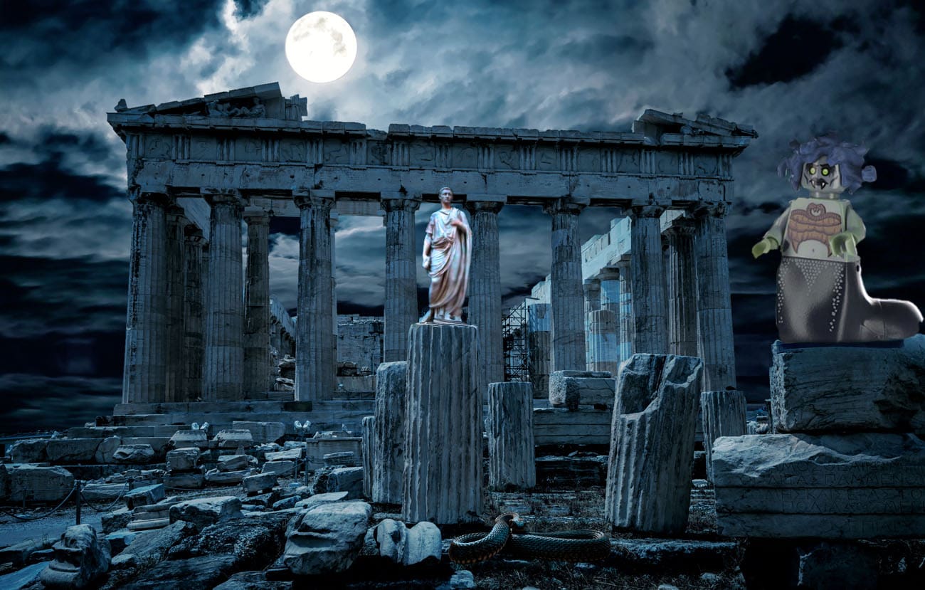
Medusa in the Ruins
September 29, 2025
For this project, I placed a Medusa Lego figure into a dark ancient Greek ruins scene to create a mythological feel. I added a color-matched snake and a stone statue to help the Lego blend with the setting, emphasizing the eerie, dramatic atmosphere.
Read More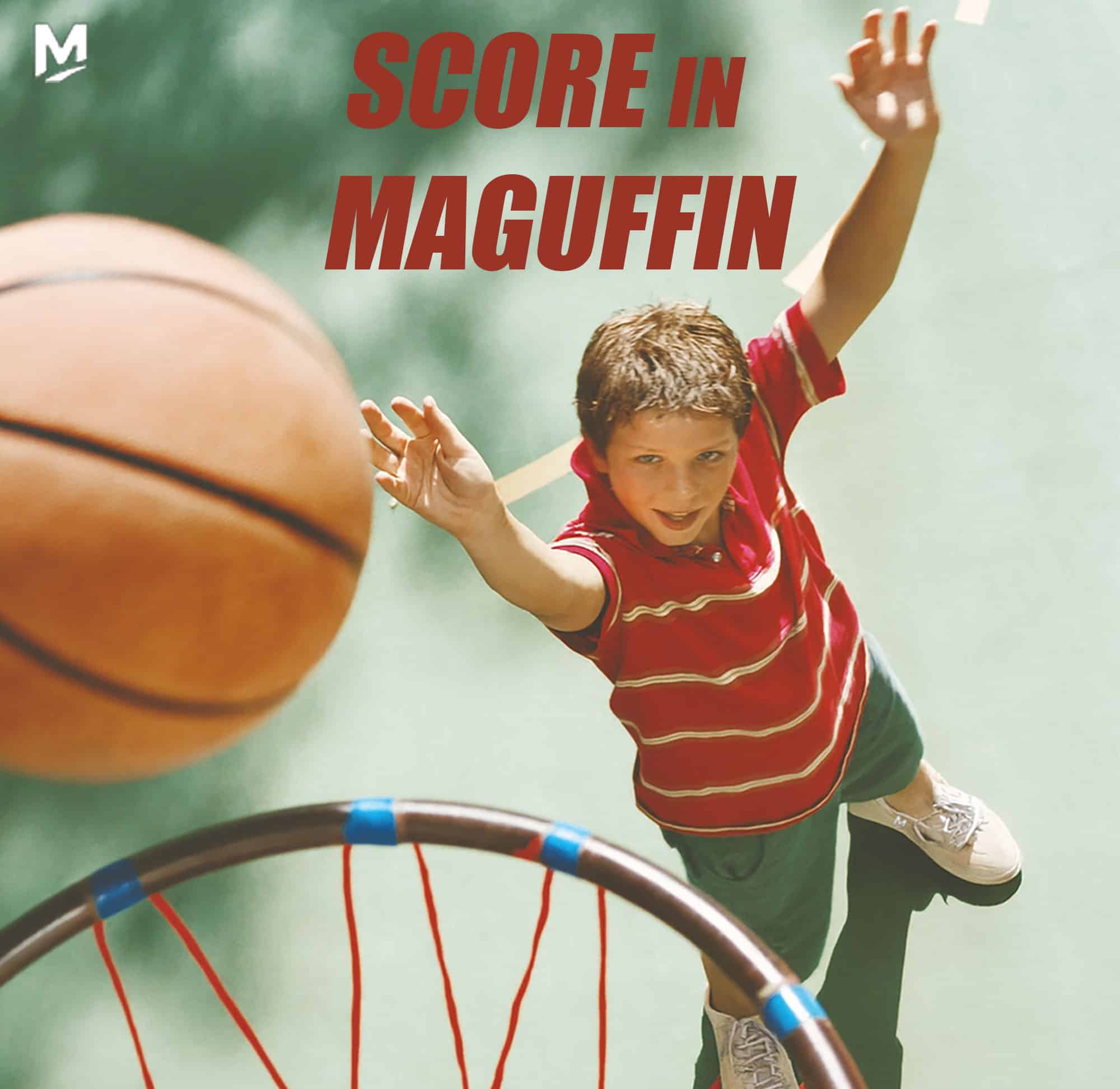
Maguffin Moves: Basketball
September 24, 2025
For this project, I created two basketball-inspired designs for Maguffin. In the first, I highlighted a fresh, youthful energy by adding the Maguffin logo onto the shoes and corner, using bold, sporty text that matches the colors of the scene. For the banner, I focused on strong, motivating words paired with bright, energetic tones, also incorporating the logo on the…
Read More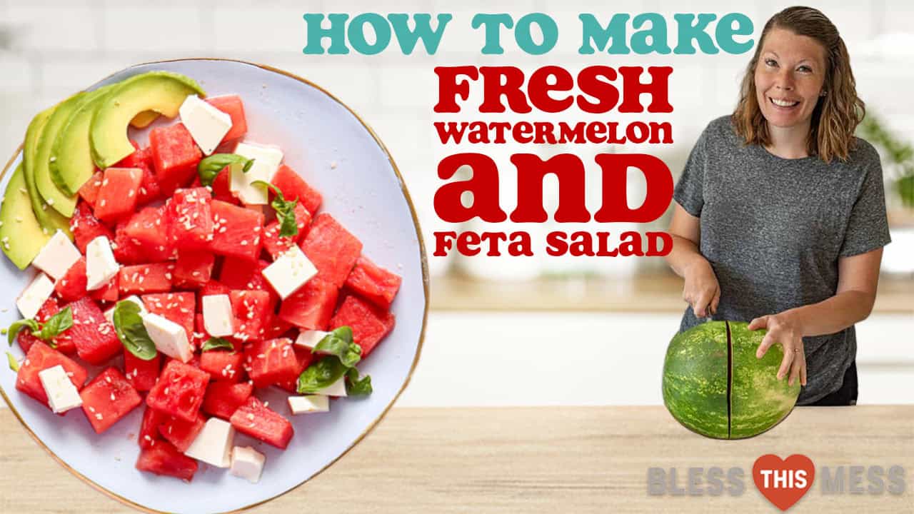
A Click Worthy Watermelon Look
September 17, 2025
I created a thumbnail that feels both trendy and homey. I used a photo of Melissa cutting a watermelon to match the recipe and highlighted her happy expression to draw viewers in. I also added her logo and branding colors for consistency.
Read More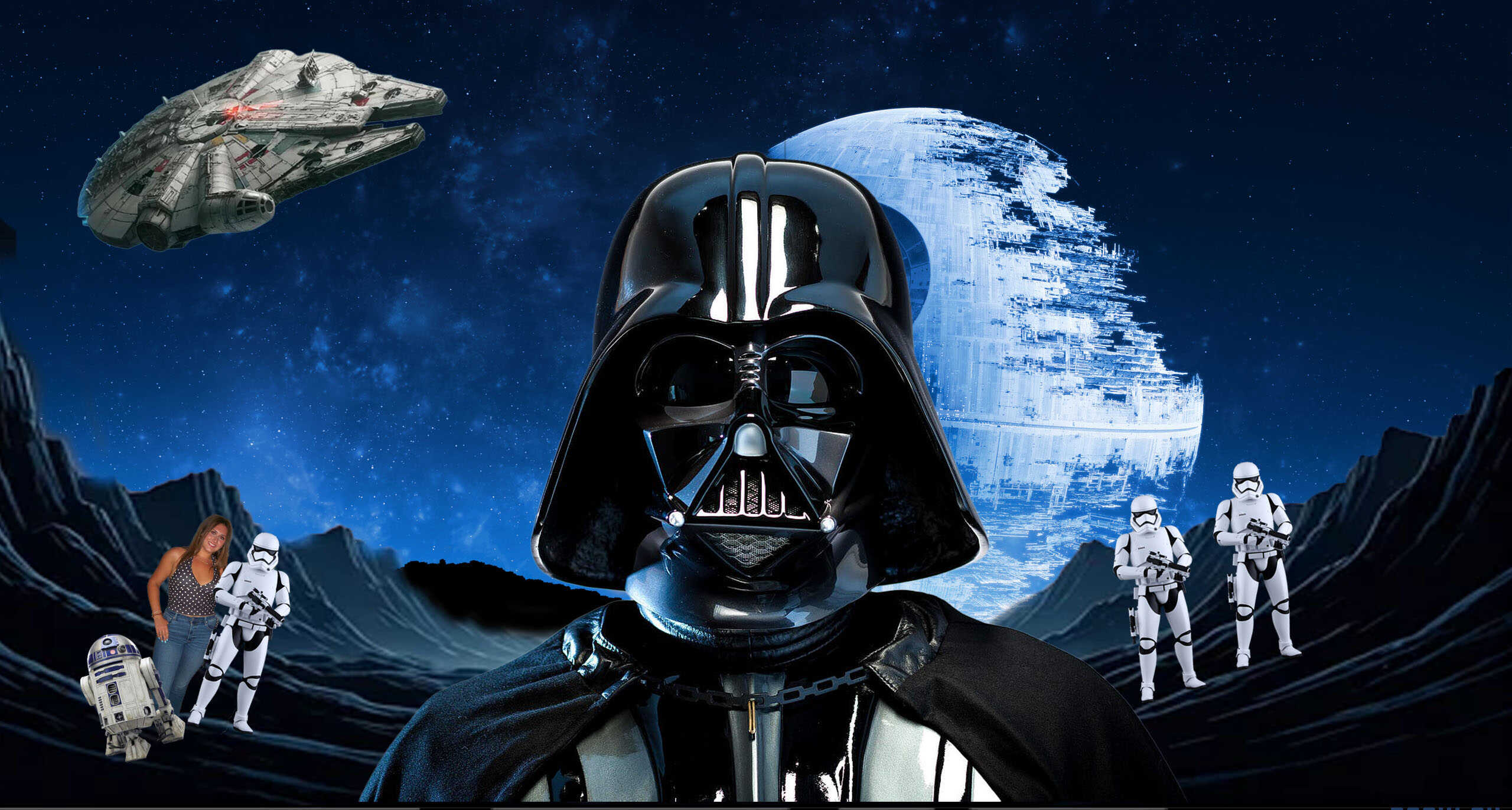
Return of the Assignment
September 15, 2025
I decided to create a Star Wars poster-style design. I placed Darth Vader in the center with the Death Star behind him to give it that dramatic movie look. To make it more fun and personal, I added myself into the scene next to a stormtrooper and included R2-D2 so we could pose as the good guys. I wanted the…
Read More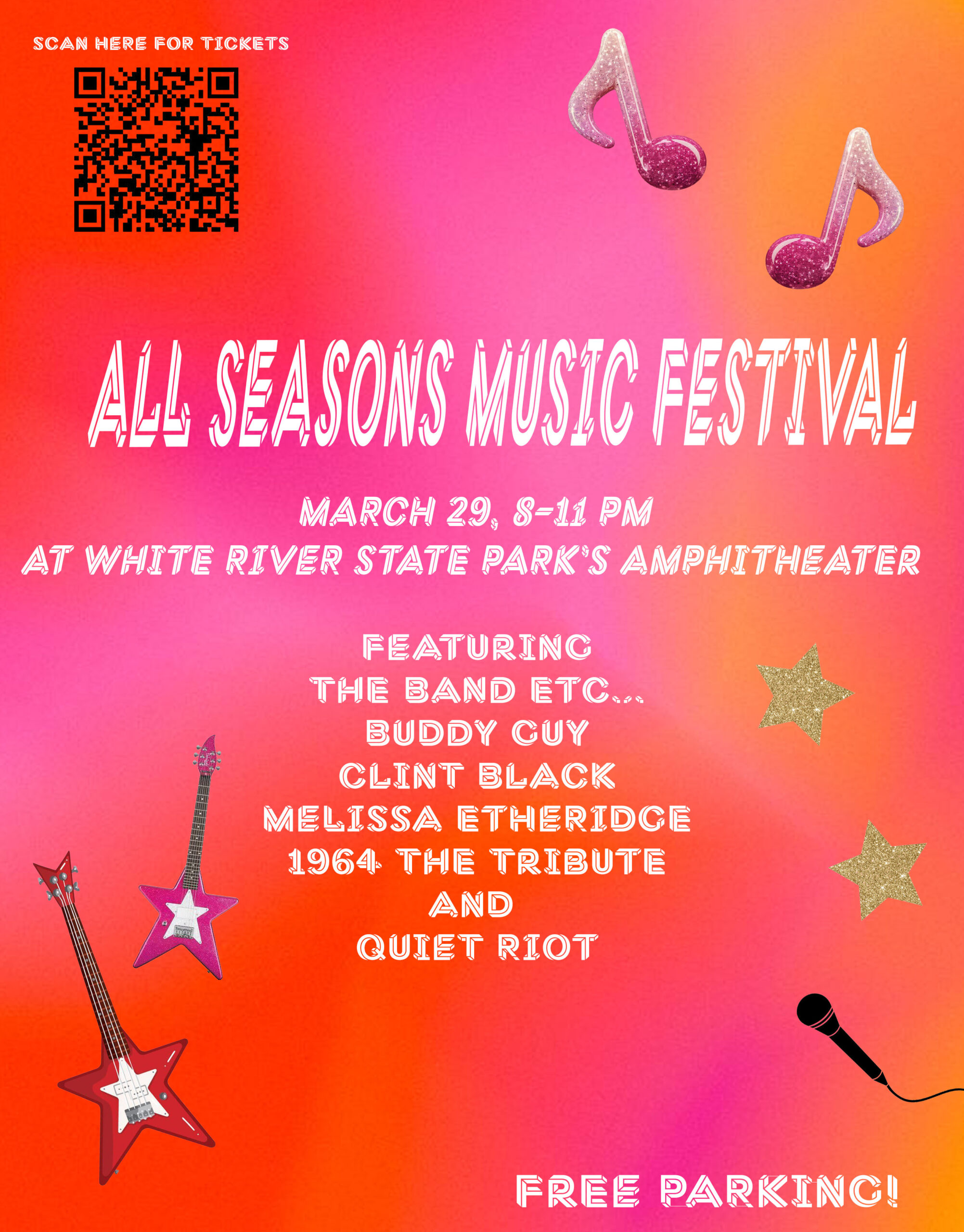
All Seasons Music Festival Flyer
September 8, 2025
I designed a flyer for the inaugural All Seasons Music Festival. I wanted the style to feel fun and bold, so I used bright colors, playful fonts, and modern music elements to match the “big fun” vibe the client asked for. I made sure all the important event details stand out clearly, including ticket access with a QR code and…
Read More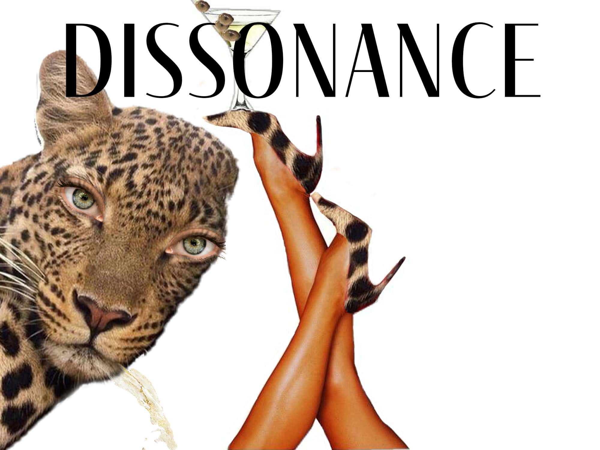
Where Chic Meets Dissonance
August 31, 2025
I included the cheetah itself to tie everything together. I replaced its original eyes with human eyes and placed the cheetah’s eyes in the martini glass as the “olives.” This creates a reversal between human and animal, the person is wearing cheetah print while the cheetah takes on human qualities. I also had the cheetah spit out the martini to add tension and a sense of disgust, since its own eyes are in the drink. I chose the word “Dissonance” because it reflects the clash of elements that don’t belong, while still keeping the piece chic and unsettling.
Read More