
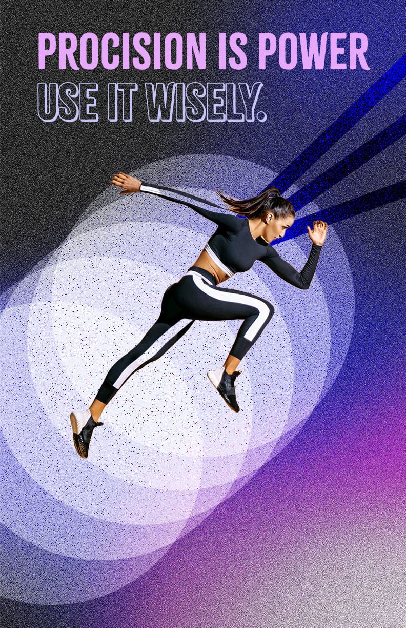
For this project, I wanted to make a design that felt fast and strong, kind of like a modern sports ad. I used a photo of a runner and built everything else with shapes to show motion and energy. I layered circles and angled lines in purple and blue to make it look like she’s bursting forward. I played around with opacity and gradients until the background felt balanced but still exciting. Overall, I like how the colors and shapes work together to make the image feel alive and powerful without needing any extra effects.
Leave a private review
Use this form to submit a private rating of this material. A notification will be sent to the instructor and may impact scoring. You can use the post comments below for a public comment.
I think you accomplished your goal really well here; the colors pop and the type contrast well for good legibility. I really like that the runner’s shoe rests exactly on the edge of a circle. The shapes are fun yet feel intentional. I also like the noise pattern, but my one suggestion would be to make sure the pattern doesn’t show through the white arm and leg making the woman feel like she has holes in her (make them all white like the bent leg).