My process
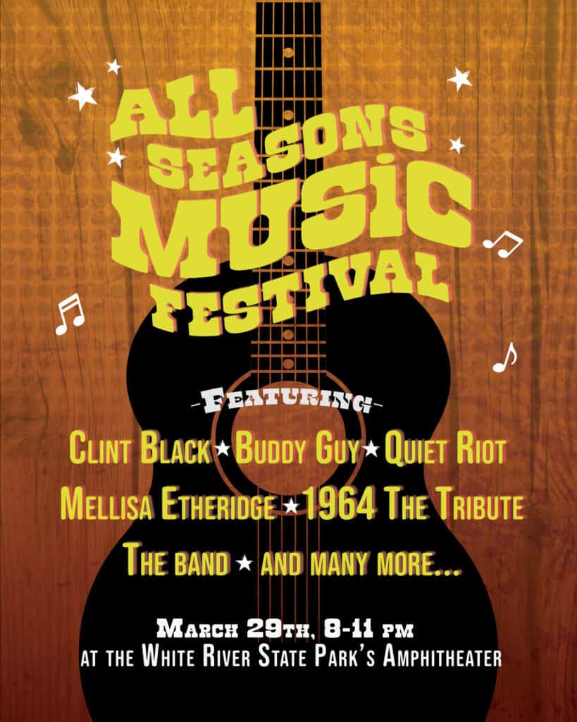
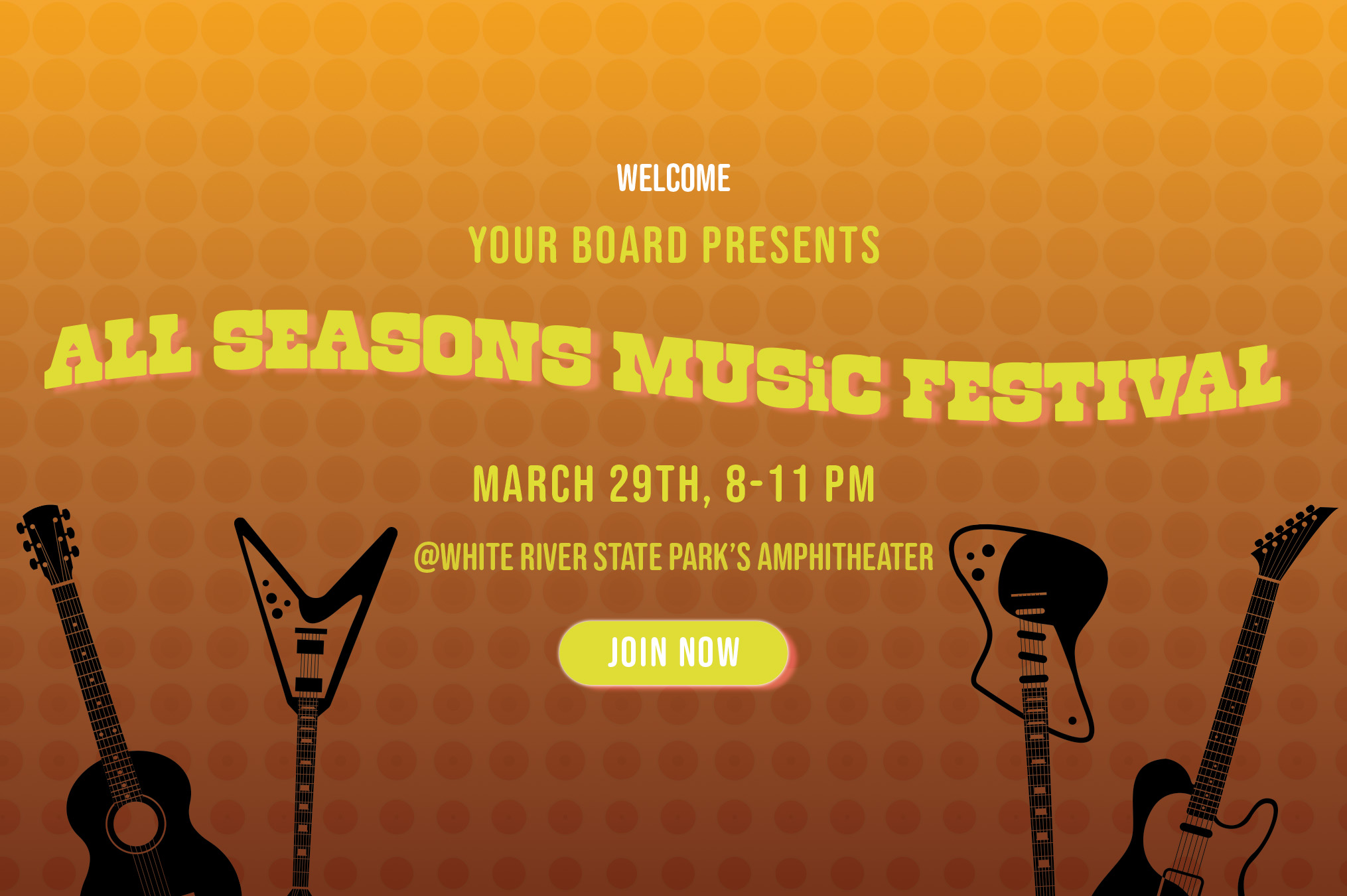
For this project, I really wanted to try and make a piece that was heavy on the textures. I had three in total on top of the gradient. I put a wood texture because I felt that it brought elements of nature + the wood of the guitar vector. Then, I added a messy, smoky texture to add more visual interest and a half-tone layer just because I wanted to play with half-tones. It also helped with making the top of the page not so empty. It was a fun, but difficult time playing with the warp text tool on the title as well as adding a drop shadow. I hope the hierarchy translates well. The reason why I went for a more country/acoustic style theme to everything is because of the list of artists that are part of the festival. With a quick google search, all of them play the guitar in some way or another. I also chose a warmer color palette to once again tie into the seasons, specifically summer in this case. As for the banner, I copied over the gradient and half-tone and decided to put another text warp on the title. Instead of a QR code, I opted for a “clickable” join now button to which I added a outer glow and drop shadow.