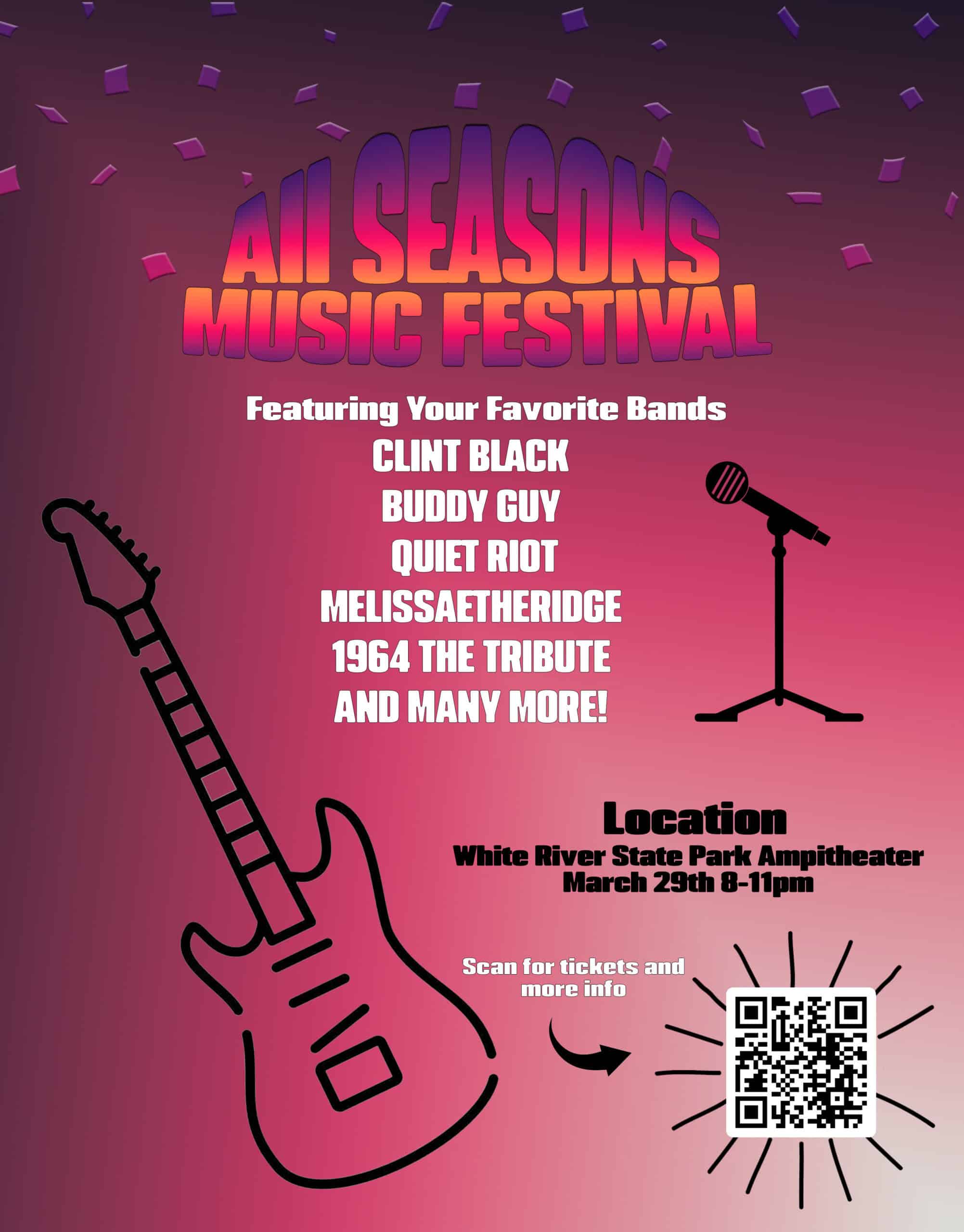
This is my go-around at creating a flyer for the all seasons music festival. My goal was to be able to incorporate the “big fun” idea into a graphic that also delivers an eye catching visual. With the usage of gradients over text and imagery, I felt these goals were accomplished. I also incorporated instruments as big icons to really emphasize the “big fun” part of the flyer. The confetti also helps achieve my goal of fun as it brings a playfulness or celebration vibe to the image. Using specific fonts and layer filters I was able to achieve unique type throughout the graphic.
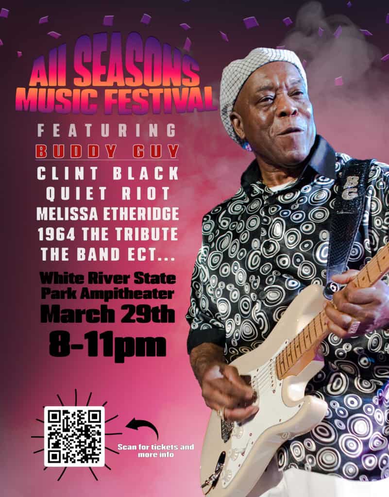
After a short discussion with Justin about techniques, I have come back to this assignment to try and improve on my original idea. During the re-design I focused on drawing attention with a figure. I ended up messing around with a few of the featured artists like Clint black, Quiet Riot, and ultimately ended up going with this “action” shot of Buddy Guy. I also felt that there was a much needed change with the spacing and layout of the text. So, the text is now more cohesive and just as informative as before, but with a lower word count. Adding a bit of dimension to the image was also a talking point amongst Justin and I. Which is where the smoky background comes from. It really helps pull the image sort-of off the page and be more life-like.


