
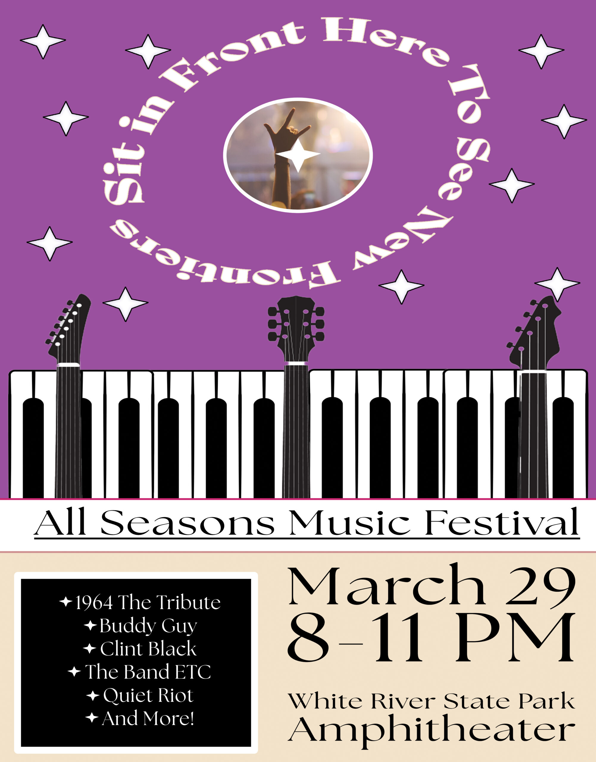
My main goal for this project was to rely less on color to pop out and more on basic features and color clash. Stars always pop out to me, and I want the idea of the festival being spectacular to be strong. It was a challenge to try and sink gradients into the starts without it looking crazy, and I meditated on the color distinction of purple and beige for days, but decided to go with it as most other flyers I see try too hard to be cohesive. My other option was changing the purple to black, but I figured that at night that would be easy to ignore.
The text wrapping around the circle on the top was for leaving a lasting memory. Challenging a reader to look deeper at the flyer only to find a catchy slogan would allow the idea to stick more than just the design.
Cohesion in the design should clearly show all the details. I tried to give everything space and platform to clearly lead the eyes.
New Frontiers at the All Seasons Music Festival!
First published on September 8, 2025
By Jordan Shane
Leave a private review
Use this form to submit a private rating of this material. A notification will be sent to the instructor and may impact scoring. You can use the post comments below for a public comment.